Color Toning
 By Albert Pedrosa
COLOR grading is mostly used in editing movies. This is one way to set a mood and trance the audience into a different experience. If you’re a fan of the movie Matrix, you can obviously see the green in the midtones and shadows in the entire movie. It was a bit exaggerated and weird but it works, and it sets the mood and depth of every scene.
Applying grading or color toning in still photos is a lot easier than in movies. You also get a lot of control on the tones when editing, having more pixel quality than in movie frames. One way to completely flip your image from an ordinary looking photograph to something different and distinct is applying color toning.
Color toning is tricky and can ruin your image if done wrong, but of course, it really differs depending on the artist’s taste. In fact, Instagram is using color toning as filters to add a unique approach to your photos. The effect of the technique is surreal, but applying just a pinch of toning can make the difference between an everyday looking photo to something interesting.
More than Instagram, professional color toning can be done in many ways using different editing software. If you dive into the net on how photographers achieve color toning, there’s really a lot of ways. In Photoshop, you can use gradient map and introduce a color in different tonal zones and blend it with your original image.

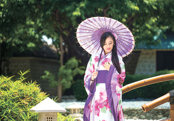
(Model: Christy of Stacy Model Management; Janice BeautyFairy for makeup)
Still in Photoshop, curves adjustment can also do the work by adding or removing tonal weight on particular channels. You can also pitch in the color balance adjustment and try to tweak the balance between colors. The most used approach in weather curves, color balance adjustments or gradient map is to add blues to the shadows and yellows on the highlight.
Lightroom can also do color toning especially when they offered per channel editing in LR5. It was possible before that, but the per channel editing under toning adjustments just opened a lot of possibilities in Lightroom. Of course for more complex work, Photoshop can do it a lot better.
The mix of adjustments used in achieving these techniques is so wide just to match the artist’s feel and taste of the image. There is no right or wrong workflow when it comes to color toning; every artist has his own way of doing it. It’s not the mastery of editing tools, it’s more on finding the color you want.
Definitely, color toning is not advisable for beauty-type of shots. It will kill the natural color of skin. Food photography is also not a fan of color toning. It is normally used for conceptual or editorial type of shots. Maybe it can work with portraits but with minimal color deviation from the original color.
Always try and find different techniques in photography, only then can you find your signature look. Keep on shooting, everyone!
photomania.sunstar@gmail.com
www.albertpedrosa.com